In today’s data-driven world, effective visualization is the key to turning raw numbers into meaningful insights. Microsoft Power BI stands out as one of the most powerful tools for data visualization, empowering businesses and professionals to analyze and present data clearly. In this blog, we’ll explore how mastering Power BI charts can transform your analysis and help you make smarter, faster decisions.
Read More: Mastering Data Visualization: Power BI Charts for Smarter Analysis
Why Data Visualization Matters
Data visualization is more than just making graphs look attractive. It’s about communicating insights in a way that is easy to understand. Well-designed charts in Power BI allow you to:
Spot trends and patterns quickly
Compare performance across different categories
Identify outliers or problem areas
Share actionable insights with stakeholders
When used correctly, Power BI charts can tell a story that spreadsheets alone cannot.
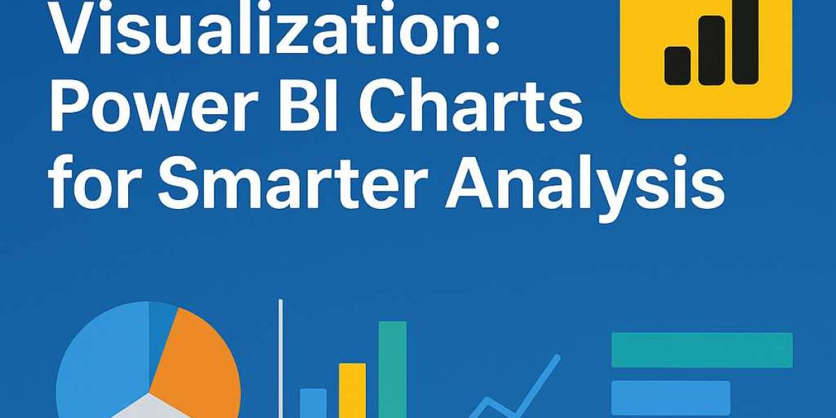
Key Power BI Charts for Smarter Analysis
Power BI offers a wide range of chart types. Here are some of the most effective ones for data visualization:
1. Bar and Column Charts
Great for comparing values across categories, bar and column charts make it easy to highlight differences in performance.
2. Line Charts
Perfect for tracking trends over time, line charts help you identify growth, decline, or seasonality in your data.
3. Pie and Donut Charts
These charts are useful for showing proportions and percentages, making it clear how each part contributes to the whole.
4. Tree Map
Tree maps are ideal for visualizing large amounts of hierarchical data, allowing you to quickly spot which categories dominate.
5. Scatter Plots
If you want to uncover relationships and correlations between two variables, scatter plots are the way to go.
6. Maps
Power BI’s map visuals are excellent for location-based data, making geographic insights easier to understand.
Tips for Creating Effective Power BI Visualizations
To maximize the impact of your charts:
Keep it simple: Avoid clutter and focus on the key message.
Choose the right chart: Match your chart type to the type of insight you want to deliver.
Use colors wisely: Highlight important data points without overwhelming the viewer.
Leverage interactivity: Power BI allows users to drill down, filter, and explore data dynamically.
How Power BI Charts Transform Analysis
By mastering Power BI charts, you move beyond static reporting and into interactive, insight-driven analysis. Instead of just presenting data, you’ll be enabling decision-makers to:
Discover hidden insights
Make data-backed decisions quickly
Collaborate more effectively with teams
The ability to present data clearly can set you apart as a professional and add tremendous value to your organization.
Visit Here: https://www.fusion-institute.com/from-hello-world-to-hired-your-journey-through-python
Final Thoughts
Mastering data visualization with Power BI charts is essential for anyone who works with data. From bar charts to maps, each visualization type serves a purpose in helping you analyze and communicate insights. By following best practices and leveraging the interactive power of Power BI, you can transform your data analysis into a strategic advantage.